 So the 2011 budget is reasonably progressive. Indeed, budgets over the last two years have been reasonably progressive (makes one wonder how reactionary a budget has to be before it is no longer called progressive). And to prove all this, the ESRI researchers ran the numbers through their Switch tax/benefit model. The Irish Times in print even headlined the ESRI article:
‘Budget changes do hit wealthier homes hardest’.
What are we to make of this?
I’m inclined to believe the Switch model. That’s because I believe models tell you what they tell you. No doubt the researchers meticulously inputted the information, using the EU Survey of Income and Living Conditions (SILC) sub-data, and accurately reported the results. It tells some useful things.
But does it tell us how the 2011 budget impacted on people’s living standards? No.
For the simple reason that the ESRI never claimed to measure the budget’s impact on living standards – the Irish Times headline notwithstanding. Let’s go through some of the numbers and see if we can. But, first, let’s deal with the fiasco over that headline.
We are Not Alike (Except in Quintiles)
One of the ESRI researchers, Tim Callan, wrote on Irish Economy:
‘The Irish Times web headline for the article – 7 words not written by us – was misleading, and contradicted the findings in the body of the article and the chart. The web headline has now been changed.’
[Just to note – the web headline now reads: ‘Budgetary adjustments to crisis have hit richest hardest’. Not sure how this changes anything]
Regarding the charge of ‘contradicted the findings’, this is a little strange. The article itself stated:
‘What of the broader picture of budgetary response to the crisis? This has been strongly progressive, as shown in the chart. Policy changes have reduced top incomes by close to 10 per cent, and middle incomes by about 5 per cent. The protection afforded to the State pension means that incomes of the second poorest fifth of the population have fallen by less than 2 per cent, as against 3 per cent for the poorest group.’
Now, the Irish Times headline may have exaggerated, may have taken the findings a little out of context. But if the ESRI claims that budgetary responses have been ‘strongly progressive’ – producing numbers to show the top income groups have taken five times the hit on disposable income than lower income groups – its hard to see where the ‘contradiction’ lies.
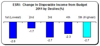 Indeed, the flap which the ESRI finds in is of their own making. The manner in which they presented their data was, to put it mildly, unhelpful – for the simple reason that we cannot tell what the impact on higher incomes is; never mind, the rich.
They present their results in quintiles. Quintiles break down the population into fifths. This is curious as the CSO presents the SILC data (which the ESRI is working with) in tenths, or deciles. This may seem academic but note this from the 2009 SILC data which shows the average weekly gross household income.
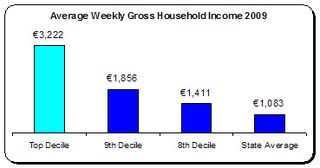 The ESRI grouped the 9th decile with the highest incomes (which includes the richest households in the country). Yet, as can be seen, household income in the 9th decile is nearly half that of the 10th – and far closer to the 8th decile and even to the state average.
When we look closer at that 9th decile group we see how relatively average they are. In 2009, the average weekly gross income (excluding social transfers) was €904 per person working in the household– or about €47,000. This is above the average industrial wage but not substantially so. Why group these income earners with those earning so much more?
We can see how incongruous this grouping is. The budget gave high non-wage income earners increases in their disposable income. But the Deloitte tax calculator shows that a couple, each on €47,000, saw their disposable incomes fall by -3.5 percent.
Unfortunately, the ESRI conflated relatively average incomes with the highest incomes. By doing so they denied us information about the impact on high income groups.
One Less Ivory Back-scratcher
But that’s a presentational issue. The real problem is elsewhere and more fundamental: a major omission in the ESRI model is that it assumes disposable income is, by implication, equivalent to ‘living standards’.
For instance, they claim that the top quintile experienced a -2.7 percent fall in their disposable income, the same as the bottom. Okay, not progressive; just neutral. But is it?
Out of our disposable incomes we must pay for necessities that we may have little cost-control over. For instance, we need housing, food, electricity, gas, telephone, etc. Therefore, our disposable (after-tax) income can be broken into two elements:
- Non-discretionary disposable income – which is spent on necessities which we have little cost-control over.
- Discretionary disposable income – the amount after both tax and necessities.
Let’s turn to the CSO’s Household Budget Survey 2005 to put some numbers on this distinction. I’m not taking this as the situation in 2011 (a new Survey will be out soon). This is only indicative. And I take only three necessities: housing, food and utilities (fuel, light and fixed-line telephone).
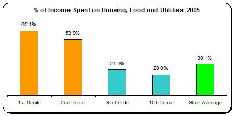 According to the CSO the average expenditure on housing, utilities and food for the poorest households came to 62 percent of gross income – falling to 20 percent for the highest-income households.
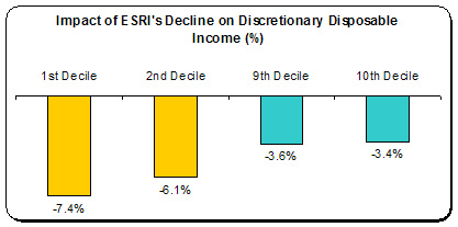
So what happens when we apply the ESRI’s -2.7 percent fall in disposable incomes to ‘discretionary disposable income’ (that is, after payments for necessities are made)?
The picture changes dramatically. Lower income households are not hit the same as high-income households – they are hit nearly twice as much. This more approximates the budget’s impact on living standards than the ESRI’s Switch model.
And remember – I only took housing, food and utilities. This says nothing about clothing and footwear, household items, travel, school payments, and the odd pint. For a fuller picture of what is the minimal essential, have a look at the excellent ‘Minimum Essential Standard of Living’ produced by the Vincentian Partnership.
But even if the impacts on discretionary disposable income were reversed – with low-income households being hit for only -3 percent while high-income households were hit by twice as much – it still wouldn’t tell us about impacts on living standards. When one is on the edge of poverty (never mind in poverty), the slightest jolt will knock you over, whereas high-income groups can withstand considerable income reductions without changing their living patterns.
When Homer was having qualms about charging hair-growth lotion to the company’s owner Montgomery Burns, Lenny tells him:
‘So what? To Mr. Burns, that's one less ivory backscratcher.’
Let’s go looking for some ivory back-scratchers in the data.
‘Til Debt Do Us Part
Another crucial aspect of living standards the ESRI Switch doesn’t pick up is the impact on indebted households. But, again, the CSO’s Household Budget Survey can give some indication from 2005. We can see which households have a surplus income – that is, income above expenditure. A negative sign indicates expenditure is higher than income.
 We know the impact of debt, arrears and inability to pay bills on living standards. Whereas in 2005 households might have had access to credit and cheap money, that is not the case today. Indeed, they are attempting to get out from under debt.
Needless to say, a household in debt that suffers a -2.7 percent fall in disposable income is in a much worse place than a surplus household that suffers an equal or even greater percentage fall. That fortunate household (and only the 9th and 10th decile households had surpluses in 2005) will be able to absorb the loss without any reduction in their living standard. Not so with the debt-stressed household.
Real and Constructed
The ESRI stated:
‘An accurate picture of the impact of the far-reaching tax and welfare changes in yesterday’s Budget must be based on a nationally representative sample of actual households, rather than a small number of constructed examples.’
But here is the problem: if the ESRI Switch model uses the SILC data it doesn’t work with ‘actual households’ either. They work, of necessity, with statistically constructed households. For instance, the SILC shows that in 2009 the average 6th decile household has 2.93 persons, with 0.76 children, 1.14 people working, 0.29 unemployed, and 0.83 economically inactive.
This, of course, is not a real household – it can’t be, and this is not the fault of any model which has to condense ‘actual households’ into statistically constructed ones. However, a clue as to why there is a popular sense that the budget is regressive is because our common experience can give insights into a model’s shortcomings. Take for instance two identical households living side by side – same demographics, same income, same everything. But:
- Household A has a mortgage, is in negative equity, and/or has a household deficit
- Household B owns their home outright and has a surplus
They may both experience the same fall in disposable income as a result of the budgetary measures. But few would say the impact on living standards are the same.
It is doubtful that one model can incorporate all the data (if it was even available) concerning ‘actual households’. That is why it is important to get as close as possible – so that it coheres with our common experience.
Getting Closer
Up to now, I have worked with the ESRI’s ‘findings’ – as Tim Callan puts it. So it must be stressed – these are just findings, based on a range of potentially subjective interventions: variables, proxies, upper/lower bounds, inputs and assumptions.
There is a time-honoured check that all modellers – whether in science or in the social disciplines such as economics – use: they compare it with what they see or feel, if only on an anecdotal level. It’s the ol’ left-hand/right-hand brain thing, the logical and the intuitive working together to obtain insight.
For instance, on the same day the Irish Times was claiming that the rich were really getting hurt, the CSO produced its latest National Household Quarterly Survey. That showed that, among employees
- The two highest paid categories – managers and higher professionals (together they earn more 60 percent higher than the average hourly wage) – had only suffered a -3 percent loss in employment.
- Below average income categories suffered far worse falls in employment: plant and machine operatives (-19 percent) and clerical/secretarial (-12 percent).
That says something about the distributional impact of living standard falls.
For instance, the Department of Finance produced their own impact on non-wage income earners as below.
The upward trajectory – turning to gain (as seen here) – should have alerted the researchers that high-income groups could well be benefiting, not losing out (indeed, it is not clear that the ESRI has factored in non-wage income or its substantial increase for next year).
For instance, the EU-SILC produces this data – the same dataset that the ESRI used for its Switch model. It shows that nearly three-quarters of all unemployed and those unable to work due to illness or 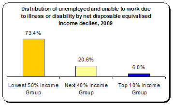 disability can be found in the lowest half of all income groups, while only 6 percent are found in the highest income decile.
This is a clear demonstration of the distributional impact on living standards owing to the recession. These are only some instances – there are others that Michael Burke refers to in a comment on Irish Economy:
- The €1.8bn cut in capital expenditure, which might reasonably be expected to impact the pupil and teacher in the portakabin rather than those in the private school
- The non-welfare provision of all services by the state, which the poor are obliged to avail themselves to a greater degree than the rich
- The role of unearned income (primarily dividends and capital gains) in supplementing the incomes of the rich, and the preferential tax treatment of same
- The wider negative economic effect of Budget measures, including increased unemployment, which pushes layers of society down the income quintiles
When we consider all these, we should at least ensure our model is attempting to capture these impacts, even if only imperfectly. They are neither comprehensive nor conclusive – but then neither is the ESRI Switch model. However, they are important and necessary pieces in the puzzle that we should be trying to put together.
* * *
This is not to dismiss the findings of the ESRI Switch analysis. It is only to show its limitations; namely, that it is cannot take one measure – impact on disposable income – and assume that it represents living standards. Even within the workings of the model it is important to note the following.
Incomes and wages move from year to year – but not always in the same direction or to the same extent. The CSO’s latest Earnings and Labour Costs release shows wages rising and falling depending on the sector people work in. Not only that, it shows for the latest 18 months (six quarters) the following declines in average weekly wage earnings:
- Management / Professionals: -1.1 percent
- Clerical / Secretarial: -6.2 percent
- Production workers: -6.6 percent
Managers and professionals, who have twice the incomes of clerical and production workers, have been able to resist the downward pressure on incomes to a far greater extent than lower-income groups; hardly surprising.
To what extent has the Switch model factored this in? And to what extent have they factored in the extra-ordinary projected increase of non-wage income next year (29 percent according to the ESRI’s latest economic commentary).
It is incumbent upon the ESRI to produce its full findings, rather than just a newspaper article. It cannot expect the public to accept its findings on faith. We have learned the harsh truth about models. We know, for instance, that the Government’s model was flawed – fatally so. We also know the considerable limitations of the ESRI’s Hermes model, upon which researchers were actually suggesting only a few months ago, that the Irish economy could return to near full-employment by 2015. We know these were badly mistaken.
At the end of the day, the ESRI’s Switch model can tell us many things – but it cannot tell us about the budgetary impact on living standards for it doesn’t seek to do so. It only gives us model-driven data to contribute one piece of a very large, more complex puzzle.
The ESRI started its article by asking the question:
‘Was Budget 2011 fair?'
After reading the article, we are no wiser.


Leave a comment